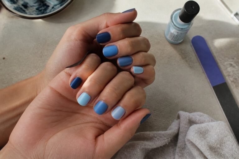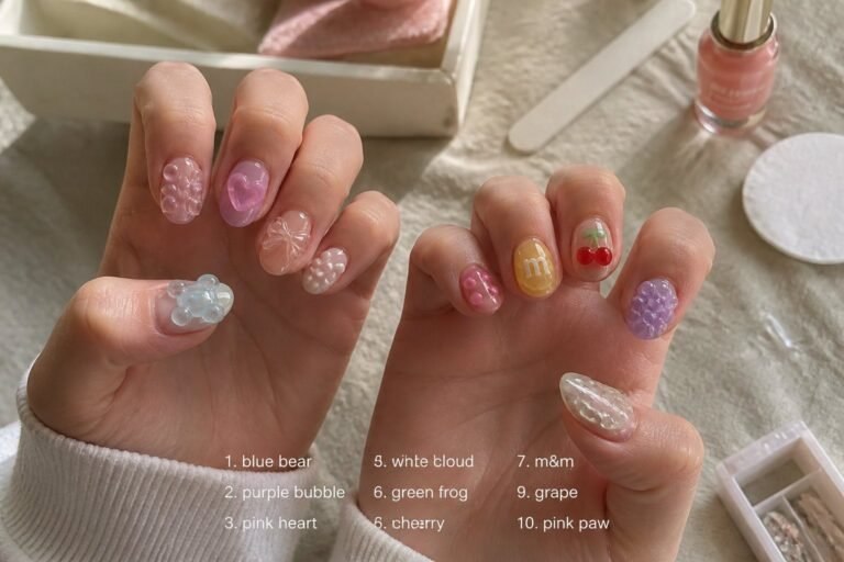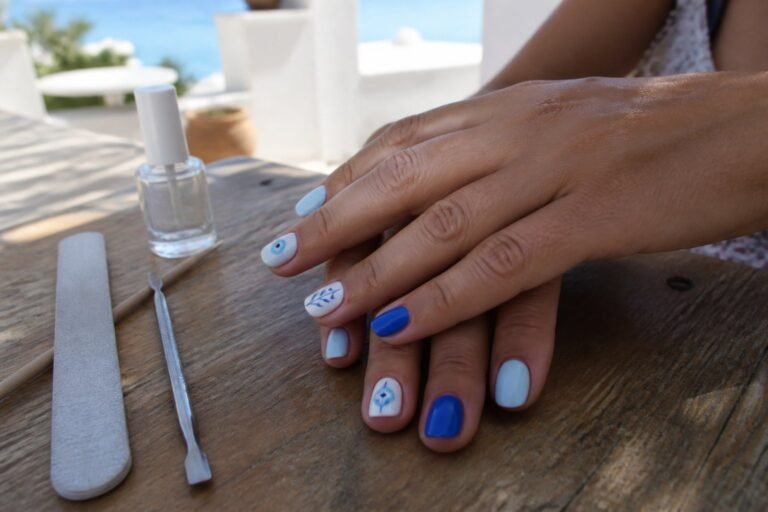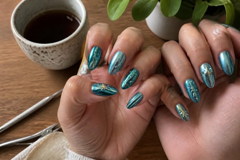
10 Mismatched Nail Ideas for 2026 That Shouldn’t Work—but Do
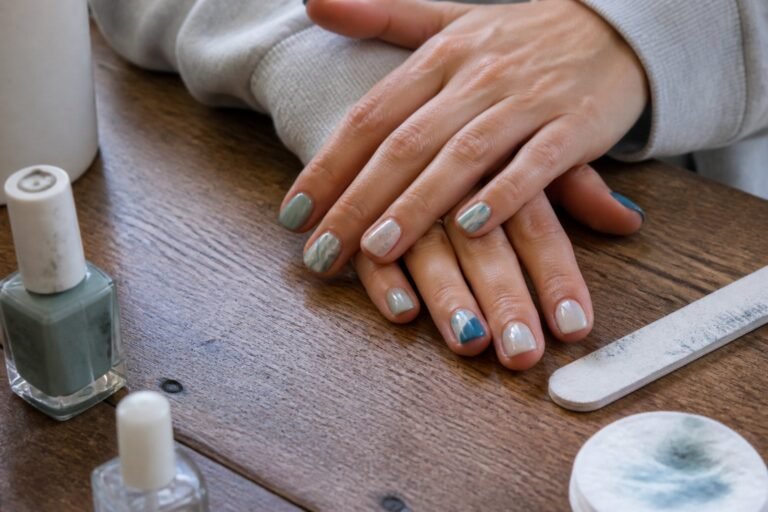
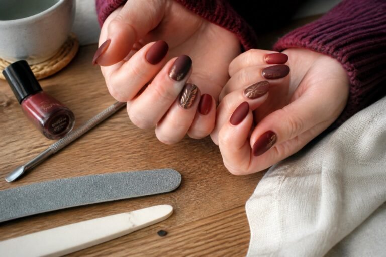
You want a mani that grabs attention without looking chaotic. You might worry that mixing glossy neons, matte neutrals, chrome, and tiny hand-painted details will clash. These mismatched nail combos work because they balance contrast with a clear theme, so you walk out with a polished, intentional look instead of a messy one.
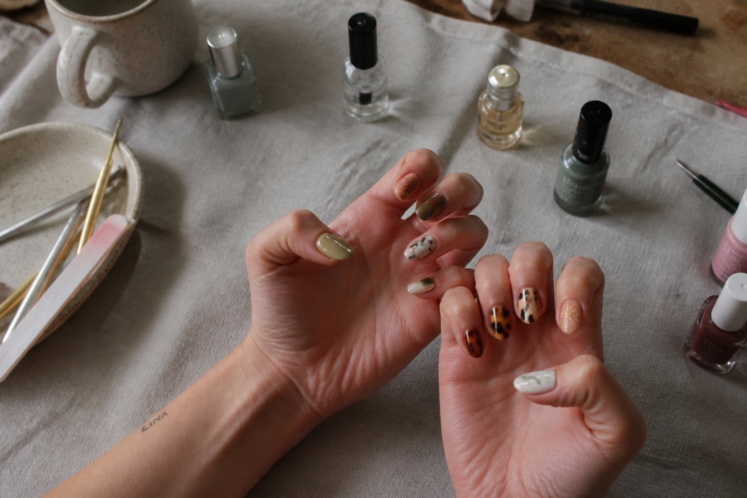
This article shows you ten bold pairings that seem unlikely but come together when you control color, texture, and placement. Expect practical tips, common mistakes to avoid, and quick how-tos that let you try these looks at home or explain them to your technician.
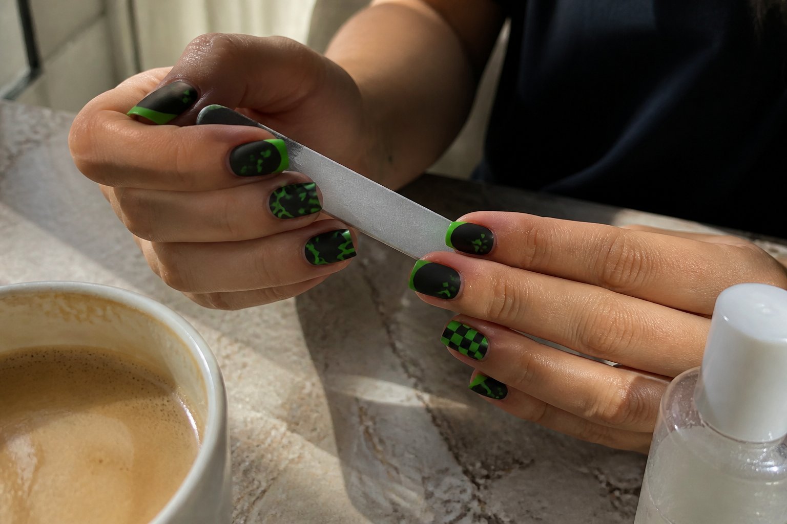
1) Matte black base with glossy neon green French tips
Intent: idea and mini-tutorial.
Try a deep matte black as your canvas and add glossy neon green French tips for a sharp contrast. Paint the matte base first and let it cure fully; glossy tips stick and pop best when the base is completely dry.
Use a thin brush or nail tape to create crisp tips. Keep the neon line narrow for a modern look, or make it thicker for a bolder vibe. A common mistake is skipping cleanup—wipe edges with a small brush and remover while the glossy polish is wet.
For longevity, seal only the tips with a fast-drying glossy top coat and avoid coating the whole nail if you want the matte/gloss contrast to stay true. Try one accent nail with reversed finishes to make the mismatched look intentional.
2) Pastel rainbow gradient thumb with checkerboard pink index
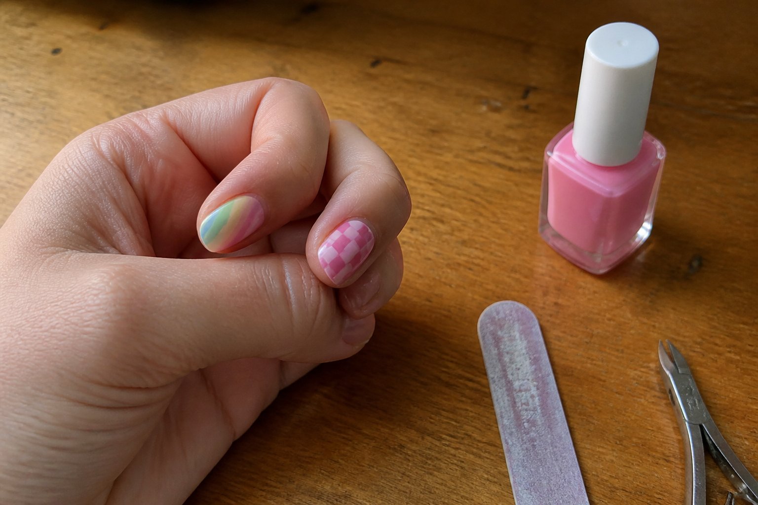
Intent: tutorial and idea. Try a soft pastel rainbow gradient on your thumb and balance it with a bold pink checkerboard on your index. Blend mint, baby blue, lavender, and blush on the thumb using a makeup sponge for a smooth fade; dab thin layers to avoid streaks.
Keep the checkerboard crisp by using striping tape or a thin brush. Pick two pink shades—one pale, one bright—to keep the pattern readable from a distance but gentle up close. A common mistake is overloading the topcoat; press lightly so the squares don’t blur.
You can wear this set as a playful accent or match more nails to either the gradient or the checkerboard. If you want inspo, look at current checkered trends for spacing and color balance (example: checkered nails starter look). Try one hand first, then adjust colors so the mix feels intentional.
3) Opaque nude with a single metallic gold foil accent nail
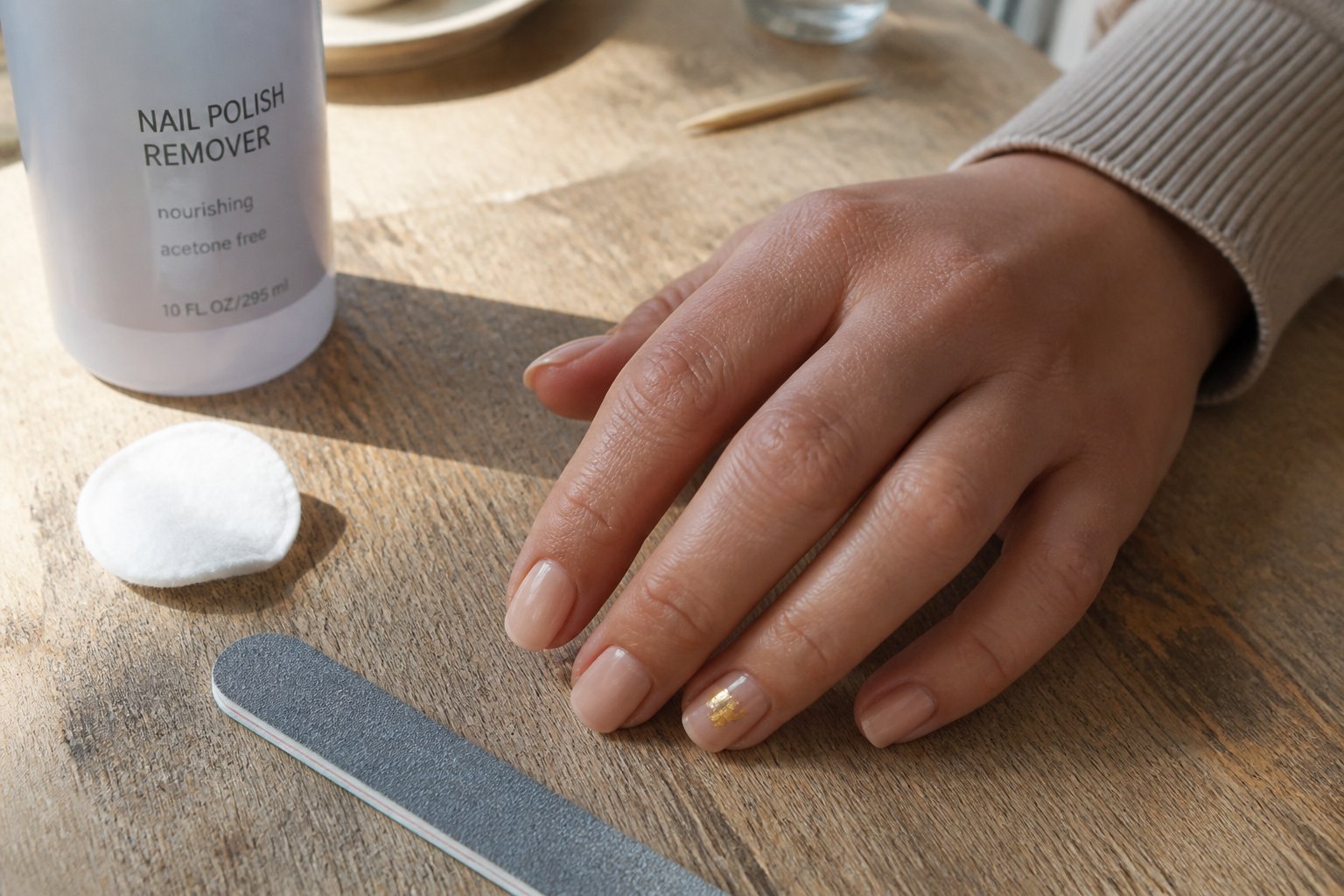
Intent: idea and mini how-to.
Choose an opaque nude base that matches your skin tone for a clean, modern look. Paint all nails with two even coats, letting each dry to avoid streaks.
Add one metallic gold foil accent on the ring finger for contrast and focus. Press small foil pieces onto tacky topcoat or use foil glue; trim edges with a small brush for a neat finish.
A common mistake is overloading the foil—too much makes the nail look messy. Keep the foil concentrated and seal with two thin glossy topcoats to prevent lifting.
Try a matte or satin topcoat on the other nails to increase contrast and make the gold pop. If you want more drama, switch the accent to the thumb for a fresh twist.
4) Milky white base stamped with tiny black stars on alternating fingers
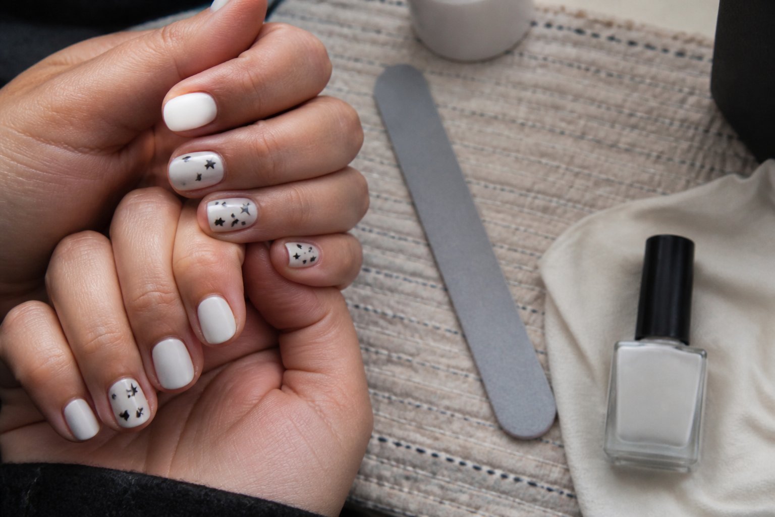
Intent: tutorial and idea.
Start with a creamy milky white base that reads soft and clean. Paint all nails in two thin coats for even opacity; this shade hides brush marks and flatters any length.
Stamp tiny black stars on every other nail for a playful contrast. Use a fine stamp plate or a steady dotting tool to keep shapes crisp; larger stars can look clumsy on short nails, so scale down.
Alternate fingers—thumb, middle, pinky—so the set feels balanced without matching. A common mistake is heavy black polish; wipe the stamp plate well and press lightly for a delicate print.
Seal with a glossy topcoat to lift the milky sheen and protect the stamp. Try swapping one stamped finger for a single silver dot if you want a subtle twist.
5) Textured velvet burgundy ring finger against glossy rose on others
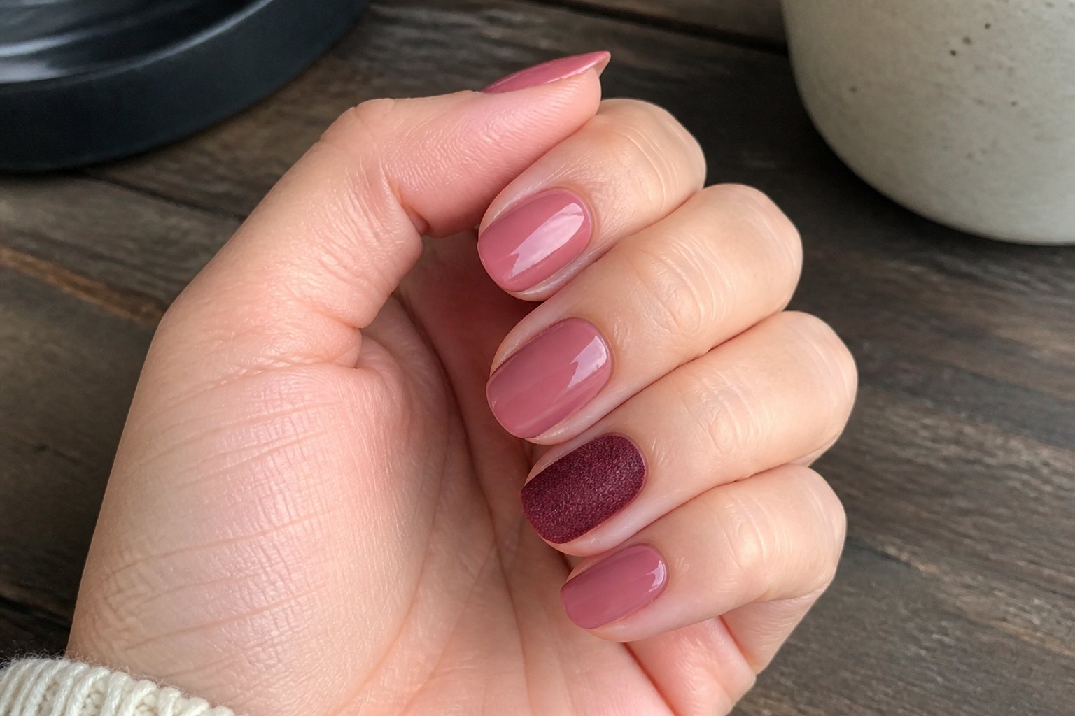
Intent: idea — show a chic contrast using texture and color.
Make the ring finger the star with a plush, velvet burgundy finish while painting all other nails a clean glossy rose. This combo feels rich without being loud and works for short or long nails. Use a matte velvet top coat or a flocking powder on the ring finger for a true velvet nap.
Start by applying two thin coats of glossy rose on four nails, letting each layer dry fully. On the ring finger, lay down a burgundy base, sprinkle flocking fibers or buff a velvet top coat before it sets, and press gently to avoid gaps.
Watch for common mistakes: don’t overload the velvet powder and avoid touching wet glossy nails. Clean edges with a tiny brush and acetone for a sharp, salon look. Try a tiny gold stud at the cuticle if you want a subtle accent.
6) Sheer jelly blue with hand-painted tiny white daisies on random nails
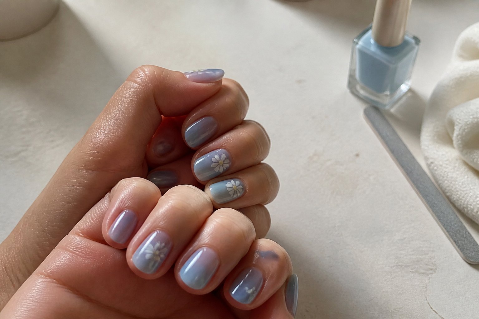
Intent: idea and mini-tutorial.
Use a sheer jelly blue base for a fresh, summery look that still feels wearable. Paint tiny white daisies on three or four random nails, not every finger, to keep the mismatched vibe modern and easy.
Start with two thin coats of jelly polish so the color stays translucent. For daisies, use a dotting tool or a toothpick to make five small petals and a tiny yellow center. Practiced strokes make petals even; test on a nail wheel first.
Avoid overcrowding the nail. Leave negative space to let the jelly glow through. Common mistake: thick top coats that smudge delicate petals—use a thin, quick-dry layer instead.
Try one accent nail with a solid cobalt for contrast. If you want inspo, browse curated daisy ideas like the Blue Daisy Nails reel collection.
7) Half-moon negative space cream paired with glossy crimson on adjacent nails
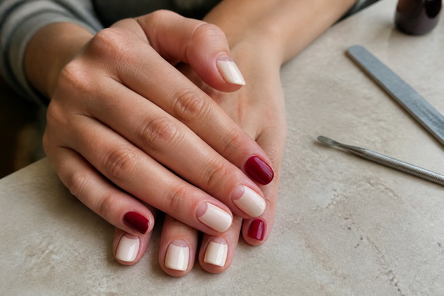
Idea: pair a bare half-moon at the cuticle in creamy nude with a high-gloss crimson on the next nail. This contrast reads modern but still wearable.
Tutorial: paint the cream half-moon freehand or use a sticker guide for a clean crescent. On the adjacent nail, apply two thin coats of glossy crimson and finish with a fast-dry topcoat.
Watch for mistakes: don’t overload the brush near the cuticle or the half-moon will smear. Let each layer dry fully to avoid drag lines between colors. If your crimson stains, seal the cream with a ridge-filling base first.
Try swapping shapes—tiny dots or thin lines—if the half-moon feels too stark. Test on one hand before committing to a full set.
8) Speckled stone-effect gray thumb and marigold glossy middle finger
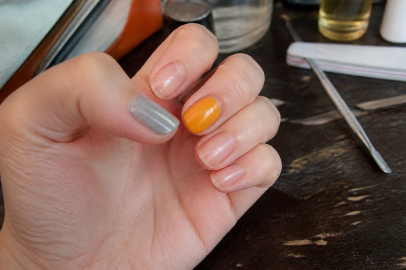
Idea — pair a textured, speckled stone gray on the thumb with a shiny marigold on the middle finger to create a bold contrast that still reads polished. You’ll balance cool and warm tones while keeping the rest of the nails neutral or softly sheened.
Tutorial — start with a matte dove-gray base on the thumb, then add tiny darker flecks with a thin brush or a sponge dab. For the marigold middle, use a high-gloss topcoat to make the color pop against the textured thumb.
Common mistakes to avoid: don’t overdo the speckle—too many dots flattens the stone effect. Also avoid clashing finishes; limit glossy accents to one or two nails so the look stays intentional.
Try alternating ring and index with sheer nude or soft white to frame the pair. If you like, show your tech during a manicure and ask for micro-speckling for a finer, more natural stone look.
9) Chrome silver index with matte coral on remaining nails
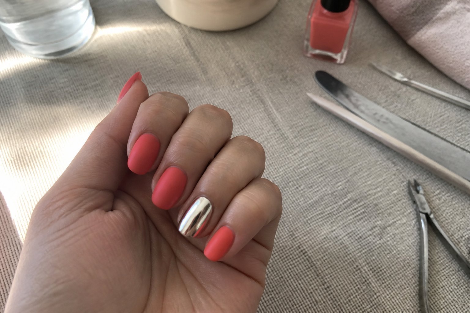
Intent: idea. Try a chrome silver accent on your index finger while painting the rest matte coral for a bold, balanced look.
Paint your index in chrome silver first, then apply thin top layers to avoid streaks. The mirror finish pops next to coral’s soft, muted tone and keeps the design chic rather than noisy.
Use a gel chrome powder or a chrome polish for the index and cure properly. For coral, buff lightly and use a matte top coat; this avoids shine bleed and keeps edges crisp.
Common mistake: skipping a clean base coat. That causes lifting and dull chrome. For a subtle upgrade, add a tiny silver dot or thin stripe on one coral nail to tie both finishes together.
10) Holographic flakie pink on ring finger and satin beige on others
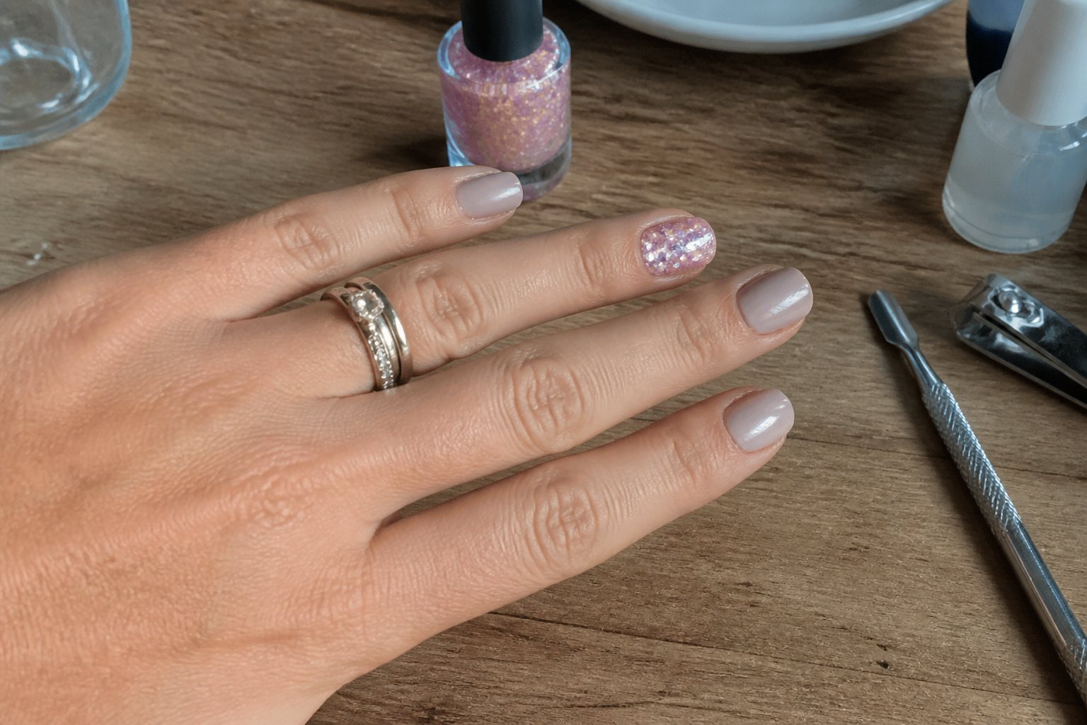
Intent: idea — a subtle showstopper for everyday wear.
Choose a satin beige as your base for a clean, low-key look. The smooth matte sheen keeps most nails neutral while letting a single nail become the focal point.
Apply holographic flakie pink on the ring finger for sparkle and dimension. Use thin layers to avoid bulk; press flakes gently so they sit flat. A clear gel topcoat locks shine and prevents chipping.
Common mistake: overloading flakes that create lumps and catch on fabric. File lightly between layers and finish with a glossy seal for durability. Try hot pink flakies for contrast or softer rose for a muted effect.
If you want a tutorial, start with two coats of beige, cure each, then build the flakie on the ring finger in thin passes. Try this at home or bring the idea to your tech for a precise finish.
Understanding the Appeal of Contrasting Nail Designs
You’ll learn why mismatched nails feel playful and deliberate, and how color and composition keep them readable instead of chaotic.
Psychology of Mismatched Aesthetics
Intent: guide you to understand why mismatched nails feel emotionally satisfying.
Mismatched nails tap into personal expression. When you pick different colors or patterns, you’re signaling mood, humor, or a moment—like wearing a mood ring for your hands. That small act of choice gives you a creative boost and makes routine grooming feel new.
People also respond to novelty. A thumb with matte black and a ring finger in pearlescent pink creates a tiny surprise every time you look down. This surprise keeps you engaged without needing loud designs.
Common mistake: random contrasts that lack a unifying thread. Fix this by repeating one color, finish, or motif across nails so your design reads as intentional, not accidental.
Visual Balance and Color Theory
Intent: teach practical pairing rules so your mismatched manicure looks cohesive.
Balance starts with a shared element. Use one anchor color, a repeat texture, or a constant accent like metallic dots. That anchor ties different patterns together and makes variety feel curated.
Apply simple color rules. Pair warm with warm or cool with cool for harmony, or choose complementary colors for high contrast. Use the 60-30-10 rule: 60% dominant color, 30% secondary, 10% accent. It prevents any single nail from overpowering the set.
Practical tip: test combos on a nail wheel or paper before painting. You’ll spot clashes and fix them—swap a neon for a softened tint or add a neutral nail to calm the look. Try one bold nail and keep the rest toned down to avoid visual overload.
Expert Tips for Pulling Off Unconventional Nail Combos
You’ll learn how to pick colors that work, mix finishes without chaos, and place designs so every hand reads as intentional. These tips give clear do-and-don’t steps you can use at home or hand to your nail tech.
Choosing Cohesive Color Palettes
Guide: tutorial. Start with a dominant color and two supporting shades to keep the look grounded. Pick one shade as your “hero” — the color that appears on at least two nails. Then choose a contrasting accent and a neutral (nude, black, or white) to tie everything together.
Use simple rules: match undertones (warm vs. cool), or keep the same saturation (all muted or all bright). Example: dusty rose + muted olive + cream reads cohesive; neon lime + pastel pink + beige will clash unless you pick one to be very small. A common mistake is grabbing random bright polishes; that makes hands look busy, not curated.
Try a mini swatch test on paper or a single nail before committing. If unsure, ask your tech to replicate the swatch on one nail to confirm harmony.
Mixing Textures and Finishes
Guide: tutorial. Combine two finishes maximum per hand for a polished look. Matte with glossy creates contrast without chaos. Glitter or chrome should act as accents—reserve them for one or two nails only.
Apply finish strategically: glossy on the hero color, matte on supporting tones, and glitter as a thin stripe or tip. Example: glossy teal base, matte taupe on ring finger, and a glitter French tip on the thumb reads intentional. Avoid using chunky glitter across many nails; it overwhelms the design and shortens wear.
Common mistake: layering matte topcoat over shimmer without sealing edges—this causes patchy wear. Always finish textured accents with a clear rim seal to prolong life.
Placement Strategies for Balanced Looks
Guide: tutorial. Think in terms of weight and rhythm when placing colors and patterns. Balance visual weight by spacing bold nails apart—place a heavy design on the index and ring, not index and middle.
Use simple placement formulas: mirror (thumb + pinky), anchor (two strong nails on one hand, one on the other), or gradient (light to dark across fingers). Example: navy with metallic accent works well if you put the metal on the ring finger and a slim stripe on the thumb to balance it.
Avoid clustering all strong elements together. If you want variety, repeat one small motif—like a dot or stripe—across several nails to create unity. Try a photo or quick layout on a paper hand to test balance before painting.